
Two stocks both gained 10% this month. One of them is actually a market leader. The other is just drifting along with the crowd. The difference has nothing to do with that 10%, and everything to do with what the rest of the market was doing at the same time.
This is one reason relative strength is widely used by professional traders and stock market advisory services when screening for stocks that may have stronger potential than the broader market.
What Is Relative Strength, Really?
Relative strength isn’t about whether a stock went up. It’s about whether it went up more than everything else around it.
Think of two runners who both finish a race in 12 minutes. That sounds identical, until you learn one race was 5 kilometers and the other was 10 kilometers. The runner who covered more distance in the same time was clearly stronger, even though their finishing time looked the same. Stocks work the same way. A 10% gain means very different things depending on what the broader market did over that same stretch.
Why Absolute Price Alone Isn’t Enough
If a stock rises 10% while the Nifty 50 rises 15% over the same period, that stock actually lagged the market. It has weak relative strength, even though its price chart looks perfectly fine sitting on its own.
On the other hand, if a stock rises just 3% while the Nifty falls 5%, that stock has strong relative strength. It’s holding up far better than the market around it, which often says more about its underlying health than the small headline gain does.
How to Read Relative Strength
Analysts often divide a stock’s price by the index’s price, day after day, and plot that ratio as its own line, called a relative strength line. When the line rises, the stock is outperforming the index. When it falls, the stock is lagging behind.
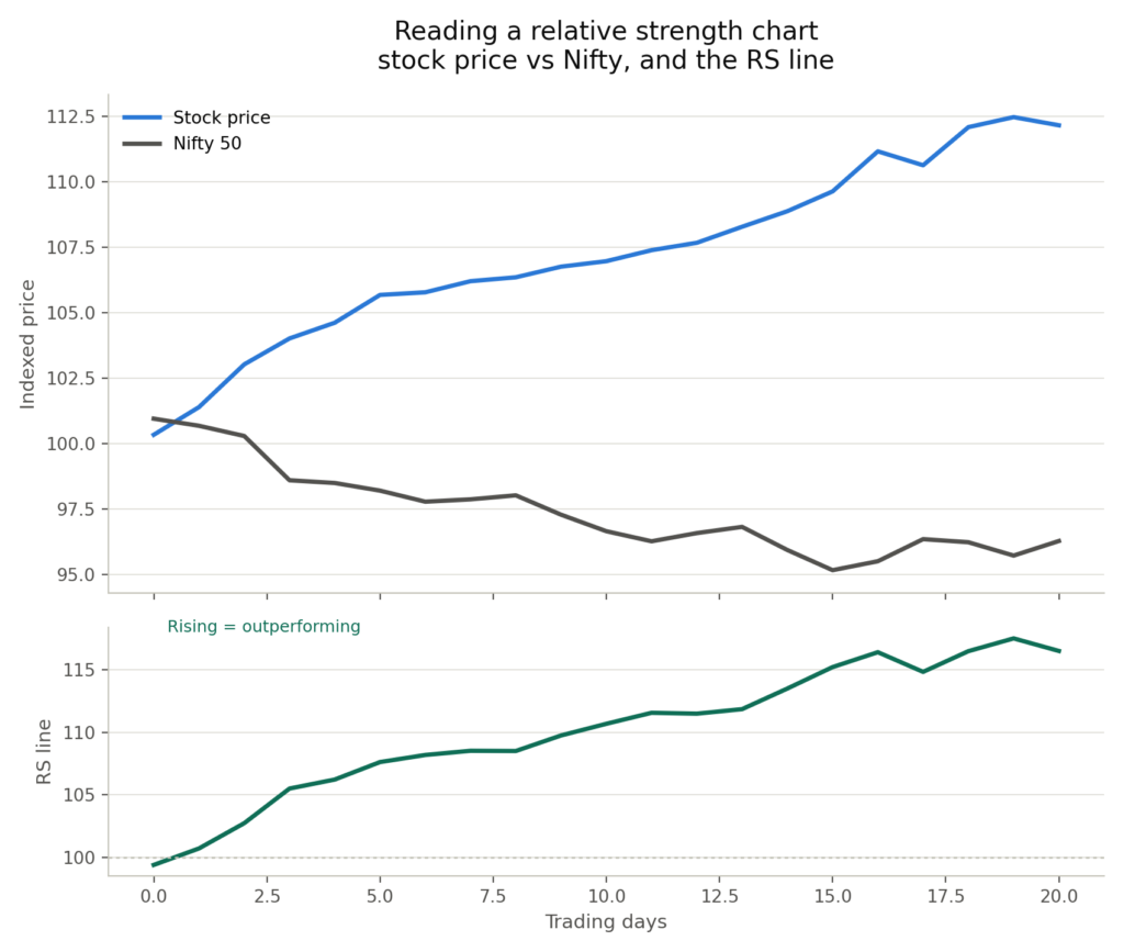
You don’t need to memorize the exact formula. The main idea is simple: a rising relative strength line means a stock is quietly pulling ahead of the pack, even before its own price chart looks dramatic.
A Quick Note: This Isn’t the Same as RSI
These two terms get mixed up constantly, even though they measure very different things. Relative Strength compares a stock to the market. RSI, short for Relative Strength Index, is a completely different tool. It measures how fast and how far a single stock’s own price has moved recently, mainly used to spot whether a stock looks overbought or oversold. Same words, very different jobs.
Why Relative Strength Can Point to Future Leaders
Stocks and sectors that show strong relative strength often keep showing it for a while. This usually reflects real underlying momentum: strong earnings, growing market share, or a business benefiting from a trend the rest of the market hasn’t fully noticed yet.
Large investors like mutual funds and FIIs also tend to keep adding to positions that are already showing strength, which can reinforce the trend further. That’s why traders watch relative strength closely. It often flags future market leaders well before they show up on most people’s radar.
Two Stocks, Same Return, Different Stories
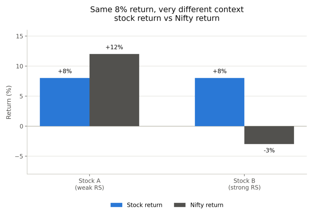
Let’s imagine two stocks, both up 8% over a month.
Stock A gains 8% while the Nifty 50 gains 12% over the same period. Stock A actually underperformed the market. It has weak relative strength.
Stock B gains 8% while the Nifty 50 falls 3% over the same period. Stock B massively outperformed the market. It has strong relative strength, and is exactly the kind of stock worth watching closely.
| Signal | Stock A (Weak RS) | Stock B (Strong RS) |
|---|---|---|
| Stock's own return | 8% | 8% |
| Nifty's return, same period | 12% | -3% |
| Relative strength | Weak, lagging the market | Strong, outperforming the market |
| What it might suggest | Riding the broader rally, nothing special | Genuine underlying strength |
How to Use Relative Strength in Practice
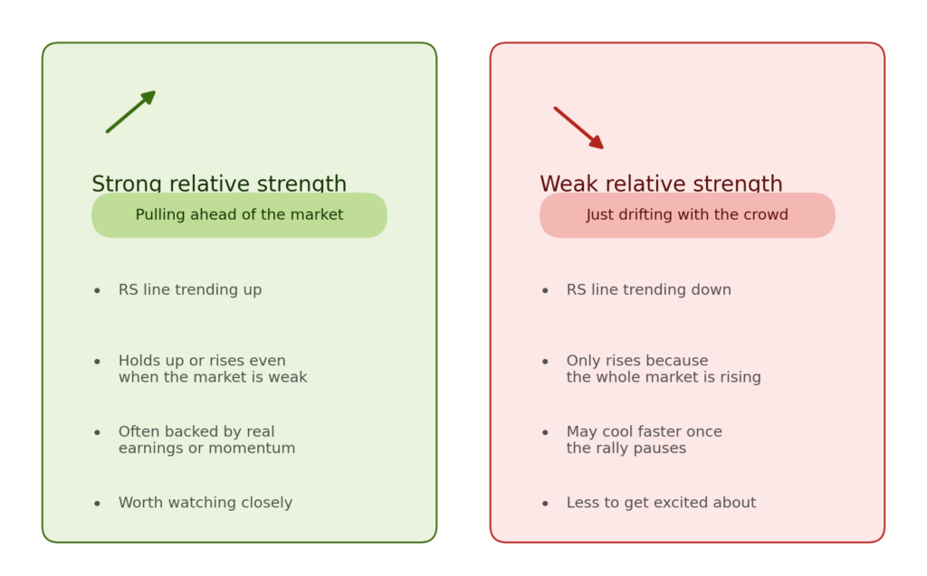
- Don’t judge a stock’s performance in isolation. Always compare it to the index, or to its sector peers, over the same period.
- Watch for stocks holding up well, or even rising, during a weak or falling market. That’s often a sign of real strength.
- Be cautious of stocks that only rise because the whole market is rising. Once the rally cools, they may cool even faster than their stronger peers.
- Use relative strength as one filter among several, not a standalone signal. It tells you what’s outperforming, not why, or whether it will last.
Conclusion
A stock’s price chart on its own is like a runner’s finish time without knowing the distance they ran. It looks like information, but it’s missing the one comparison that actually matters.
Relative strength gives you that comparison. It won’t guarantee tomorrow’s winners, but it can help investors identify stronger stocks earlier and spot a potential short term trading opportunity when price action, market conditions, and other technical signals support the setup.
The goal isn’t simply to find stocks that are going up. It’s to find stocks that are doing better than the market around them. That’s where relative strength becomes a powerful addition to the stock-selection process.