Picture this: the Nifty is comfortably in the green for the year, sitting near its highs. Time to celebrate, right? Except your portfolio is down for the month, and most of the stocks you own haven’t budged in weeks. If that sounds familiar, you’ve just met one of the market’s best kept secrets: the index can hide more than it reveals, and market breadth is what catches it.
For traders relying on short term stock trading recommendations, understanding market breadth can provide an important layer of context before making a trading decision.
What Is Market Breadth, Really?
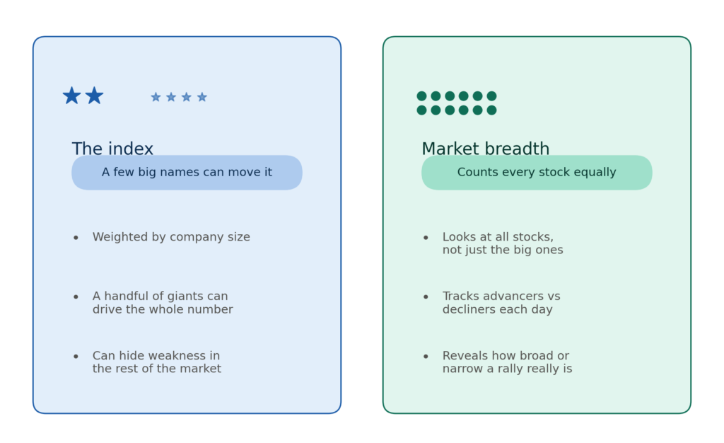
Market breadth looks past the index number and asks a simpler question. How many stocks are actually going up, and how many are going down? Not just the biggest few, all of them together.
Think of a class test score. If two brilliant students score 95 while eighteen others score 30, the class average might still look decent on paper. But that average hides the fact that most of the class is struggling. The Nifty 50 can work the same way. A handful of heavyweight stocks can pull the index higher even while most of the other stocks in the index are falling.
Why the Index Alone Can Fool You
The Nifty and the Sensex are both “market cap weighted.” Bigger companies get a bigger say in where the index moves. So a rally powered by just five or six giant stocks can push the index to a new high, while thirty or more of the remaining stocks quietly slide lower. If you’re only watching the index number, you’d never know the difference.
This is exactly the gap market breadth is built to close.
How Traders Measure Market Breadth
A few simple tools help traders check under the hood.
Advance-decline ratio. On any given day, how many stocks went up compared to how many went down? A healthy rally usually sees far more advancers than decliners.
Advance-decline line. This tracks the running total of advancing stocks minus declining stocks, day after day. When this line climbs alongside the index, the rally has broad support. When it starts falling while the index keeps rising, that’s a red flag.
Stocks above their 200-day average. This shows what share of stocks are trading above their long-term trend line, a rough measure of how many stocks are actually healthy.
New highs versus new lows. This compares how many stocks are hitting fresh 52-week highs against how many are sinking to fresh 52-week lows.
The Warning Sign: Divergence
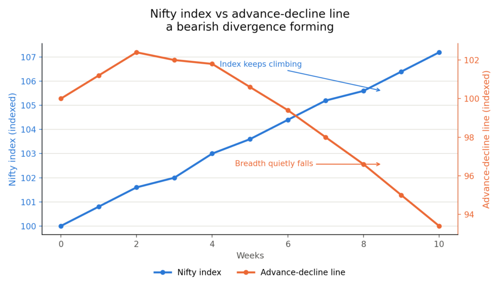
Here’s where market breadth earns its reputation as an early warning system. When the index keeps climbing but the advance-decline line starts drifting downward, that’s called a bearish divergence. Fewer and fewer stocks are actually joining the rally, even as the headline number looks great. This kind of quiet weakening has often shown up before a broader correction, sometimes weeks before the index itself turns down.
The opposite can happen too. If the index is falling but breadth quietly starts improving, with more stocks bottoming out and turning higher, that can hint at a recovery building beneath the surface, even while the mood still feels gloomy.
Two Rallies, Two Very Different Stories
Picture two trading days where the Nifty closes up 1%.
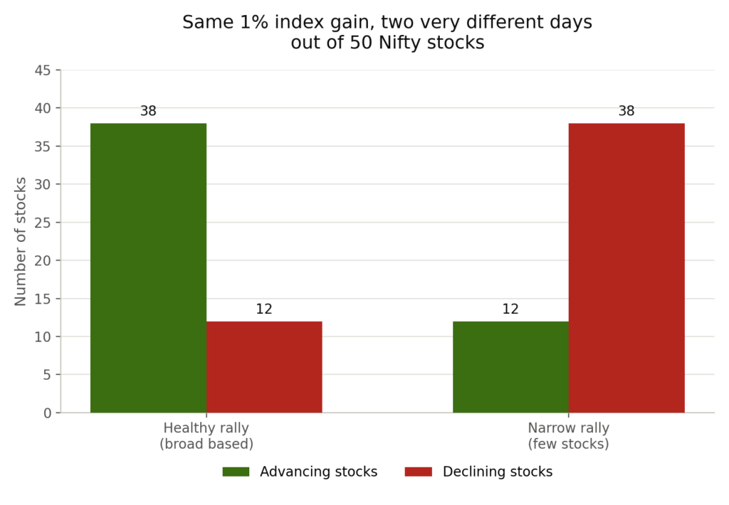
On the first day, 38 out of 50 Nifty stocks close higher. Banks, IT, auto, and pharma stocks are all participating. This is a healthy, broad based rally.
On the second day, the Nifty is up 1% again, but only 12 stocks closed higher. The gain came almost entirely from two or three heavyweight stocks having a strong day, while the rest of the index quietly slipped.
| Signal | Healthy Rally | Narrow Rally |
|---|---|---|
| Advancers vs decliners | 38 up, 12 down | 12 up, 38 down |
| Who's driving the gain | Spread across sectors | A handful of heavyweight stocks |
| Advance-decline line | Rising with the index | Falling despite the index |
| What it usually means | Broad, sustainable strength | Fragile rally, worth watching closely |
What Traders Should Watch
- Don’t judge market health by the index number alone. Check how many stocks actually moved with it.
- Watch for divergence. If the index keeps rising while the advance-decline line falls, treat new highs with caution.
- Track the percentage of stocks above their 200-day moving average as a quick health check on the broader market.
- Compare new 52-week highs to new 52-week lows. A shrinking number of new highs during a rally is often an early clue.
- Use breadth as a supporting signal, not a standalone timing tool. It tells you about market health, not the exact day to buy or sell.
Conclusion
An index is like a spokesperson standing in front of a crowd, speaking on everyone’s behalf. Most of the time, that spokesperson tells the truth. But sometimes, they’re covering for a room full of people who don’t actually agree.
Market breadth is what lets you walk past the spokesperson and see the room for yourself. It won’t predict every twist in the market, but it often notices the cracks in a rally long before the index is willing to admit them.
For investors and traders evaluating positional share trading calls in India, market breadth can be a useful additional tool for understanding whether a market move has genuine participation or is being driven by only a few heavyweight stocks.